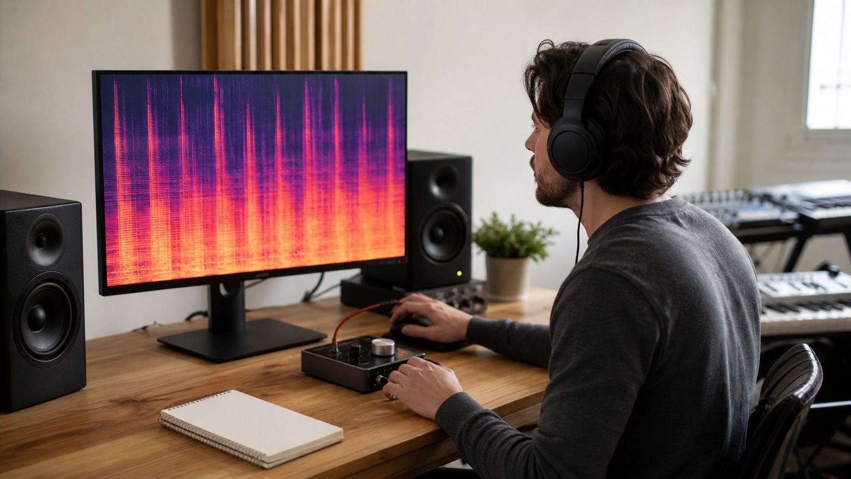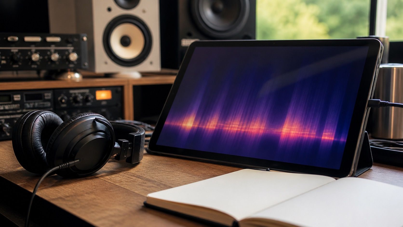
A spectrogram generator is useful in audio repair when it makes a vague listening problem easier to locate: a bright hiss band above the vocal, a click that lands before the snare, or a smeared shimmer that appears every time an AI chorus opens up. It is less useful when the image becomes a verdict by itself. I treat the spectrogram as a map for the next listening pass, not as a replacement for ears, monitors, and boring version control.
What a spectrogram can show quickly
The first benefit is speed. When a track has a sharp tick, a short dropout, or a splash of brittle top end, the waveform often looks too crowded to explain it. A frequency view separates time from pitch area, so the repair decision becomes more specific. A vertical bright scratch may point to a click. A steady horizontal fog may point to hiss. A cloudy patch around a vocal phrase may point to shimmer or a synthetic tail that did not blend with the music.
This is where a spectrogram maker earns its place in a repair workflow. You can play the chorus, watch the same few seconds, and ask one plain question: does the visible mark happen exactly when the listener hears the problem? If the answer is yes, you have a target. If the answer is no, the image is only background information. That distinction keeps you from cleaning the whole file when the real issue is one consonant, one cymbal swell, or one transition into the hook.
For Suno artifacts, I usually start with three areas. The low end can show rumble or fake room energy that masks the kick. The middle can show vocal smears, especially around sustained vowels. The high end can show hiss, metallic fizz, and over-bright cymbal texture. None of those shapes proves that a repair is needed on its own, but each one can make a listening note easier to test.
The settings worth changing first
Most people open a spectrogram generator, see a dramatic image, and assume the default settings are telling the whole story. They are not. Window size changes the balance between time detail and frequency detail. A shorter window can make clicks and transients easier to place. A longer window can make steady tones, hum, and narrow noise bands easier to see. If the defect is a tiny tick, I want time precision. If the defect is a whistle or a constant high band, I want frequency precision.
The frequency scale matters too. A linear scale can make the upper range look huge and the bass look cramped. A logarithmic scale often feels closer to how musicians talk about low, mid, and high areas. For repair work, I want enough detail to see the part I plan to touch. If the vocal harshness sits around the upper mids, there is no need to stare at a full-range view that turns the useful area into a thin stripe.
Color intensity is another quiet trap. Turn it too hot and every normal cymbal wash looks alarming. Turn it too low and a real noise floor disappears. Before processing, I like to set the display so the healthy parts of the song still look healthy. A dense master should look dense. Silence should look mostly quiet. The repair target should stand out because it matches the audible problem, not because the color palette has been pushed into panic mode.
How artifacts look different from music
Musical sounds usually have context. A snare transient sits in rhythm. A vocal formant moves with the note and the word. A cymbal wash may spread into the high end, but it follows the arrangement. Artifacts often look less connected. A click can cut through all frequencies in a single thin line. Digital crackle may appear as a cluster of small, unrelated marks. Synthetic shimmer can hang above the vocal after the phrase has already moved on.
AI music repair adds another layer because some defects are partly musical. A Suno vocal may have a vowel that sounds almost right but carries a glassy edge. A backing pad may hide a mosquito-like tone that only becomes annoying on headphones. A dense chorus may show a bright cloud that is not one instrument and not simple hiss. In those cases, the spectrogram helps you choose a smaller move: reduce a narrow band, redraw one click, soften a harsh consonant, or leave the area alone until a later mix pass.
I am cautious with automatic cleanup across the full track. A broad denoise setting can make the spectrogram look calmer while the song loses air, consonants, and drum texture. The image after repair should not be the goal. The goal is a version where the listener stops noticing the defect and the music still has movement. A clean-looking file that feels flat is not a win.
Common false alarms
A bright high-frequency area is not automatically damage. Cymbals, vocal breath, saturation, and reverb can all create busy upper bands. A hard horizontal cutoff is not always a repair problem either; it may come from an MP3 export, a sample source, or a deliberate production choice. Even silence is rarely perfectly black in a real file. Chasing all of that can lead to the kind of repair that technically removes material but makes the track less convincing.
The safer test is to compare three things at once: the sound before repair, the sound after repair, and the spectrogram at the same zoom and settings. If the mark disappears but the vocal dulls, the move was too strong. If the mark remains but the listener no longer catches it in context, the repair may already be enough. If the mark looks scary but never lines up with an audible complaint, I leave it alone and write a note for later.
Another false alarm is the lonely visual oddity. A tiny blob in the top end or a strange stripe during a transition can look important because the eye likes patterns. Music is full of patterns. Unless the oddity repeats, masks a lyric, pokes out on headphones, or triggers fatigue in the same moment, it does not deserve heavy processing. The spectrogram should slow down bad guesses, not invite new ones.
Use the image to guide listening, not replace it
A good workflow is simple. First, listen and write down the defect in ordinary language: hiss under the verse, click before the chorus, metallic vocal edge, low rumble after the drop. Then generate spectrogram views around those timestamps. Change only the settings that help the defect become clearer. Repair the smallest useful area. Finally, listen again without watching the screen, because the audience will not hear the picture.
This habit is especially important when comparing versions. Keep the same file start, zoom, window size, color scale, and playback level. If every screenshot uses different settings, the visual comparison becomes theater. A before-and-after repair check should make it easier to decide whether the processing helped. It should not create a new argument about why one image looks prettier.
For most music repair, a spectrogram generator is not a magic tool. It is a patient second view. It helps you find clicks faster, understand noise bands, avoid broad processing, and explain why a repair should be narrow. The final decision still belongs to the track: if the repaired version breathes, the lyric stays clear, and the annoying texture stops pulling attention away from the song, the image has done its job.